How to reduce waste: the dos and don’ts of signs


Great signs can significantly increase recycling rates and reduce landfill.
What can and can’t be collected changes often and differs widely across Australia. Having signs clearly state what can and can’t go in each bin makes it easier for people to do the right thing. This reduces inefficiency and problems at recycling facilities.
Keep these tips in mind:
Use visuals and short descriptions to convey information. Use photos instead of icons to avoid misinterpretation.
Use colour-coded backgrounds to indicate recycling streams.
Include 2 clearly defined sections on each sign to outline what can and can’t go in each bin. Ideally keep it to less than 7 examples for each.
Text should be large enough to read clearly at 3m on approach to bin. Content should be printable on A3 paper.
Post at head height, above each bin. If your workplace has any employees who would struggle to read a sign at average head height, print and display signs on the front of each bin.
Sign templates
We’ve produced 5 template waste signs you can download and use in your office. They’re editable Word documents.
You should edit and update the signs as they apply to your office. Convert to a pdf before printing.
If you want to print copies using a professional printer, you’ll need the versions with bleed.
If you’re using your office printer to print the signs or a service like Officeworks, you’ll need the versions without bleed.
General waste sign - also called landfill, as this is where it will end up!
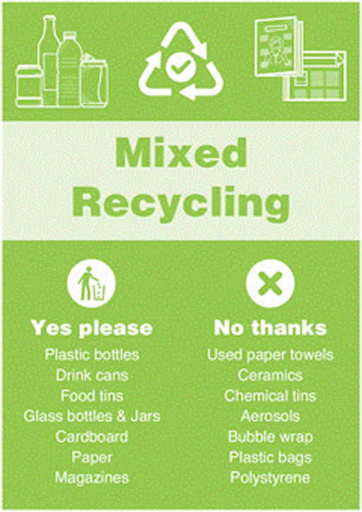
Mixed recycling sign
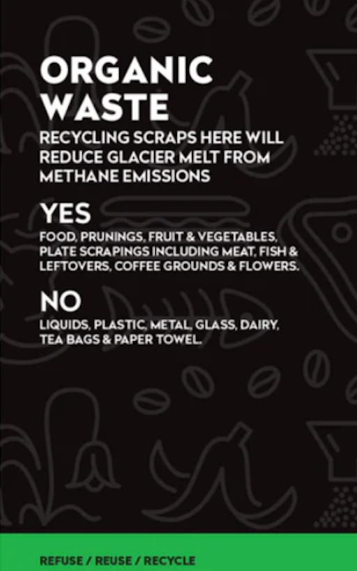
Organics signs - 2 colour options – lime green (without bleed) and burgundy (without bleed)
Guidance on colours varies between states and territories. Green is often used in the office.
Download lime green with bleed
Paper and cardboard sign
10c refundable sign
We recommend you speak to your property manager to verify which items are supported and which items are considered contaminants for each waste stream.
For example, if you have an organics stream, you’ll want food scraps to go in this bin and not in the landfill bin. And on the red general waste sign, you should remove the apple and bread images and update the list of supported items and contaminants.
Check on tricky items such as tea bags, paper towels and compostable containers with your property manager. They will understand where and how your organics are being processed. Each state and territory has their own mandate on what items can go in the organics bin. The NSW EPA, for example, forbids compostable containers.
Coffee cups should also be removed from your general waste stream if you have a separate coffee cups collection.
Customise your templates - example
Here's two examples of how you might customise a template to suit your circumstances.
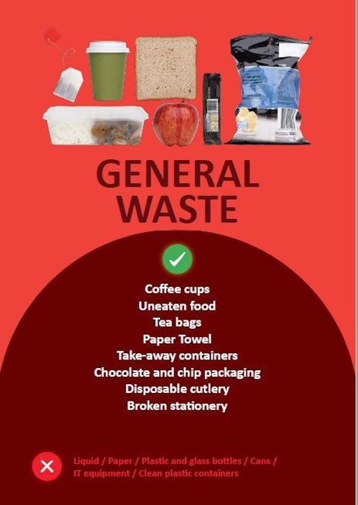
If you don't have an organics (food scraps) bin, keep the apple and bread image in the sign..
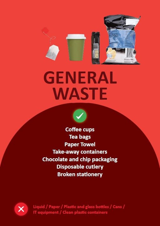
If you do have an organics (food scraps) bin, delete the apple and bread pictures and remove the text 'Uneated food' from the accepted items list and add it to the unaccepted items list.
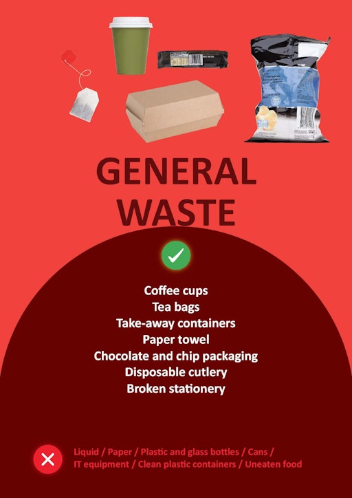
Do a visual check regularly. If you notice a particular item is often put in the wrong bin, add an image of it to the correct bin sign.
For example, if you find cardboard takeaway food containers regularly in your mixed recycling bin, add a picture of it to the general waste sign.
This container looks like cardboard, but they're often soiled with food, contain a plastic lining or are actually plant-based or made from compostable material, so they can't be recycled.
Common design mistakes
Too much text
Font size being too small
Writing all in capital letters
Unclear graphics
Overcrowding – lack of space
Lack of contrast in colours
This sign has too much text. The average person will not stand there and read through this.
The text examples of what can and cannot go in the bin are too small and close together, making them difficult to scan.
Writing all in capital letters makes it more difficult for people to read.
The graphics are not easily visible. They are too far in the background, and too low contrast.
The green at the bottom is the only use of colour to indicate which bin it is – it’s not prominent enough.
In Australia, green is commonly used for organics bin, rather than recycling (which is often yellow), so this can be confusing.
There are no images to illustrate the most common contaminants.
There’s not enough difference in colour or lines between the accepted and not accepted lists/
Great signs can make all the difference to reduce confusion and improve recycling rates. Get in touch with your program manager if you have any questions or comments on the signs available. Or better yet send us a photo of your signs in action!